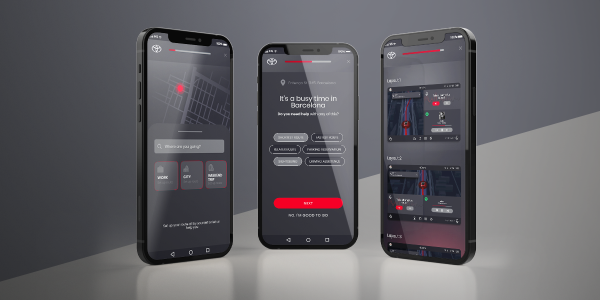
Project Brief & Problem
Cars are becoming products that are smarter and smarter, which form part of a users’ digital ecosystem. Car manufacturers focus on the seamless continuity of digital life when stepping into a private or shared car.
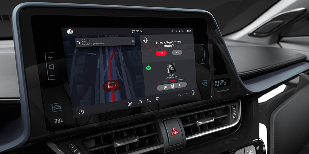
Toyota Connected Europe invited us, Allwomen academy UX/UI students, to help them with the personalization aspect of the on- and off-board digital experience (mobile app + infotainment system) in which they want to understand and design a system that helps users feel comfortable, safe and satisfied when driving in European cities, or more specifically: in Spain.
The Team
For this project, I worked with my teammates Ana Huerta, Milagros Alvarisqueta, and Doris Jurkovnik.
My role
I was involved in all phases of the project, from mapping out the problem to delivering final designs.
The Process
Timing and the organization with my teammates were key to this project. We worked hard for 10 weeks on this challenge, and we explored different UX research techniques to come up with the best UX product and UI design possible.
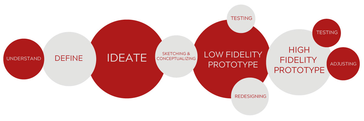
1. Understand
Desk Research
Our first step was to understand what was happening in the automotive world, what an infotainment system can do to help users, and what are the trends for the future.
Interviews & Affinity mapping
Then we needed to understand the people. We conducted 15 interviews to identify pain points, opportunities, and insights.
- Ages between 23-42
- With driving license
- Living in Europe
- Own, share or rent a car
Then, we processed the data, looked for patterns, and sorted them out by themes.
2. Define
Hypothesis
We wrote a Hypothesis for our project based on our research and problems findings…
Archetypes & User Journeys
We found that we had two types of users, and we created two archetypes, which we called: the renter and the owner. And we mapped out user journeys for both of them.
Problems & HMW
Then, it was time to define our problems and How Might We, and for that, we did develop another Affinity Mapping that helps us group them and focus on the most important ones.
3. Ideate
Our idea
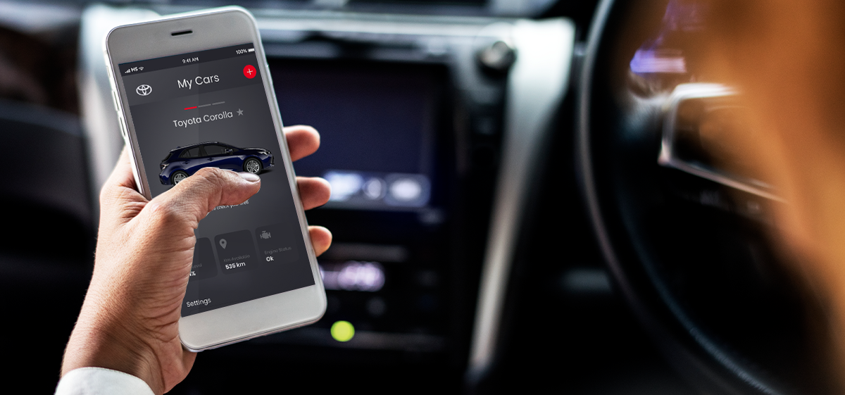
Your car should be on your phone, no matter the car you drive. That’s the base of our idea.
Kano Survey
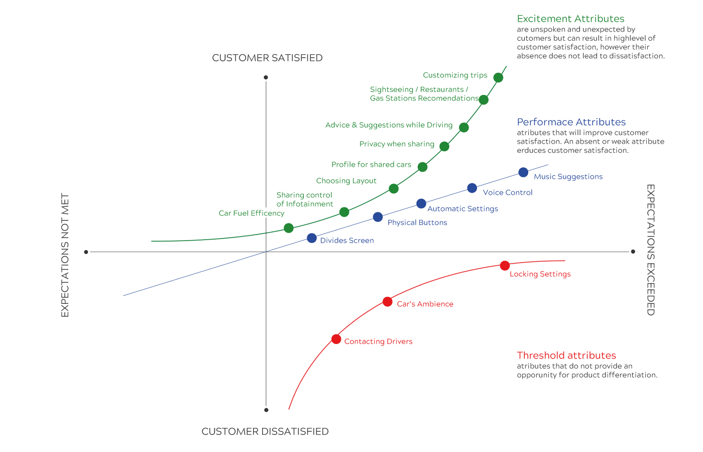
We wanted our product to meet the user’s expectations. We started by doing some brainstorming so we had a lot of ideas for our product. But, how could we prioritize and decide what features were the ones that meet those expectations? That’s when we decided to use the Kano Model to start making design decisions by selecting the right features.
Crazy 8’s
After summarizing the information we gather and focusing on the right direction and features, it was time to start sketching.
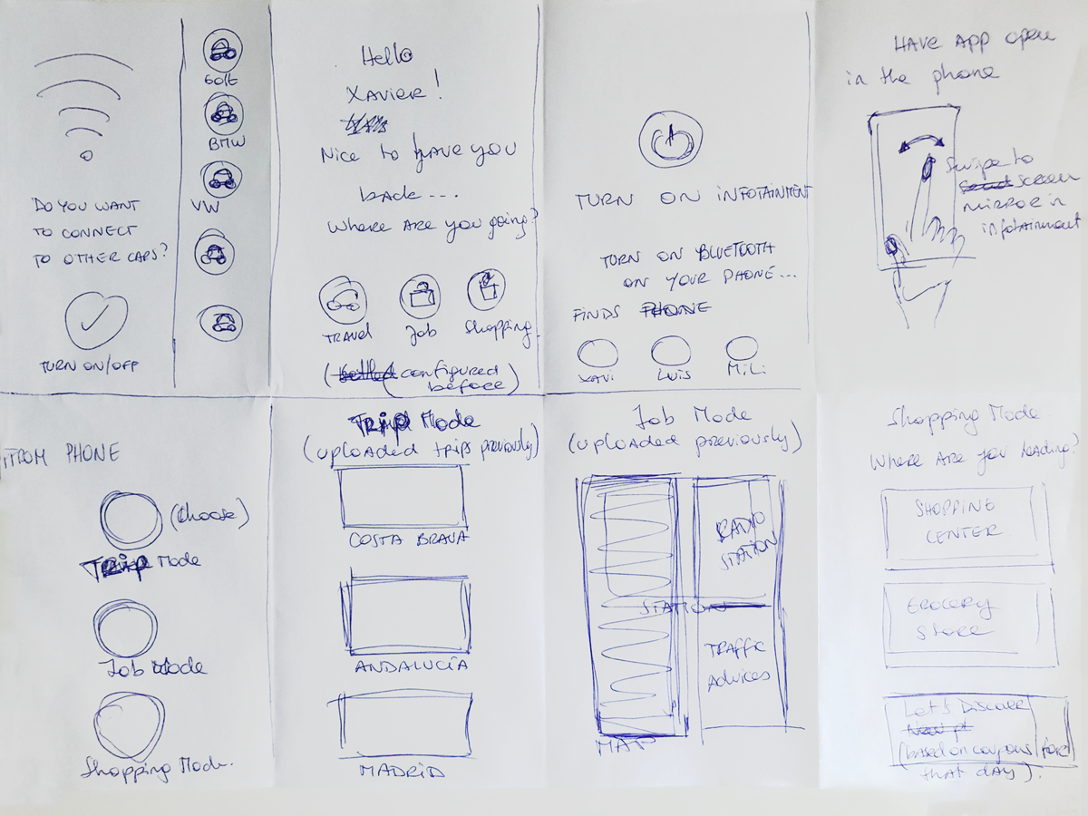
User Flow
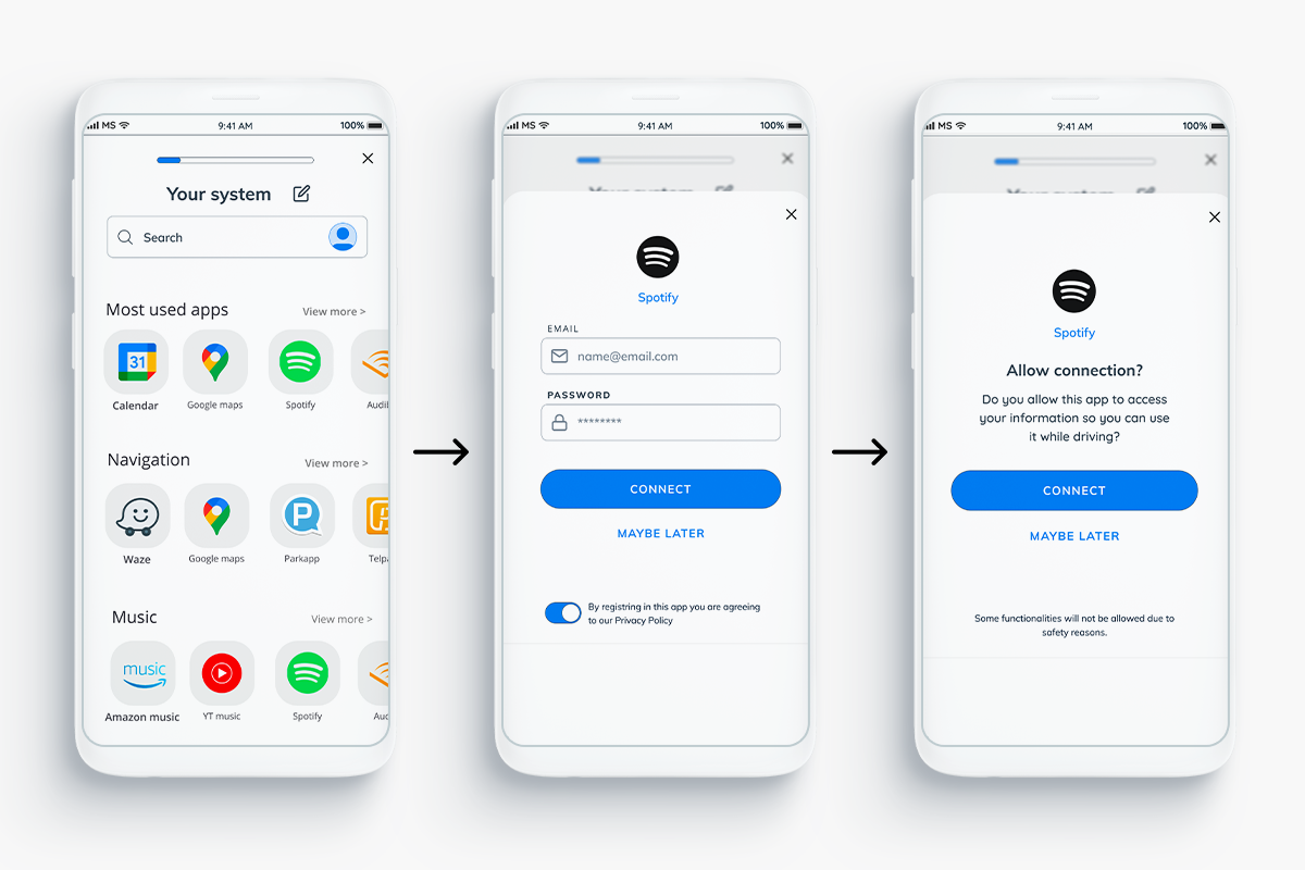
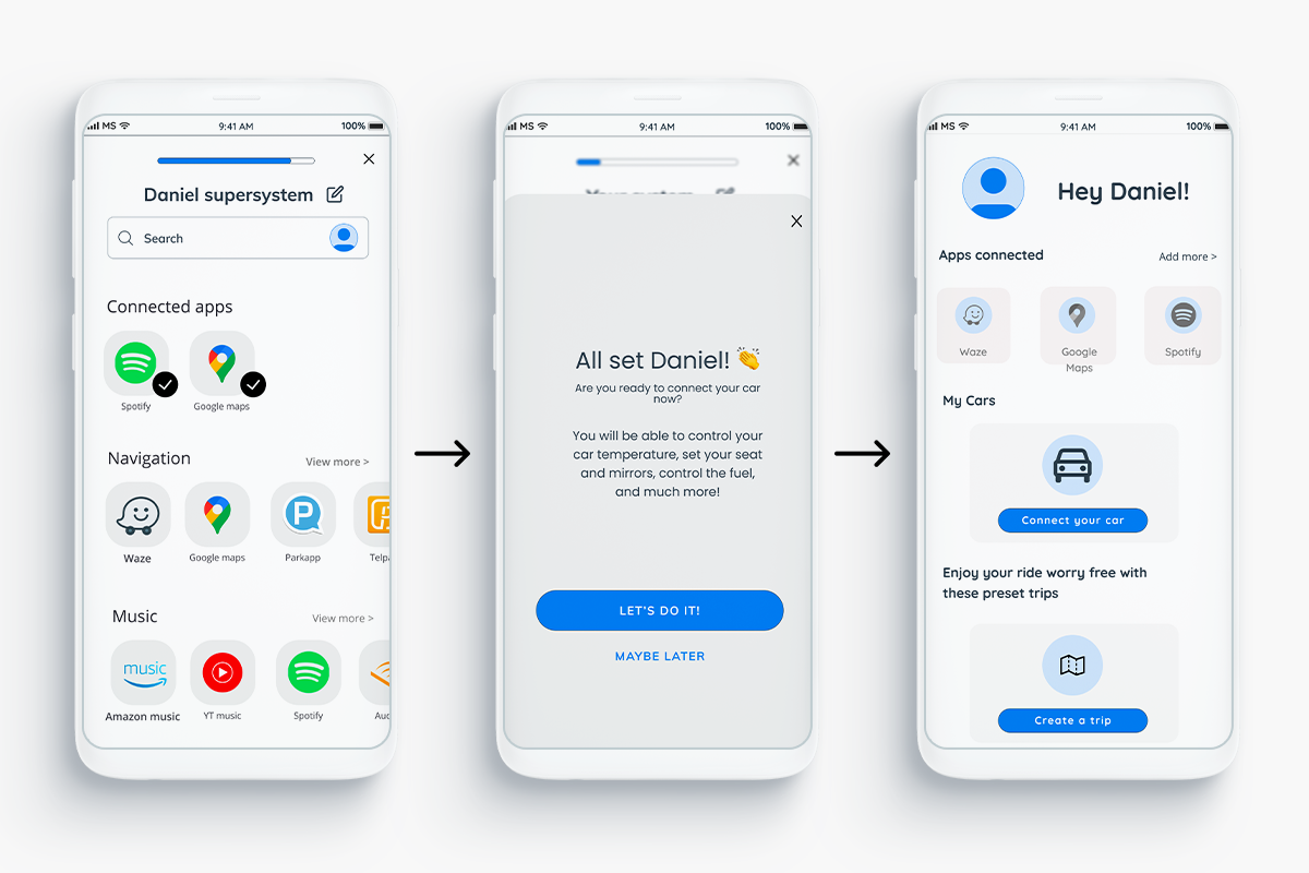
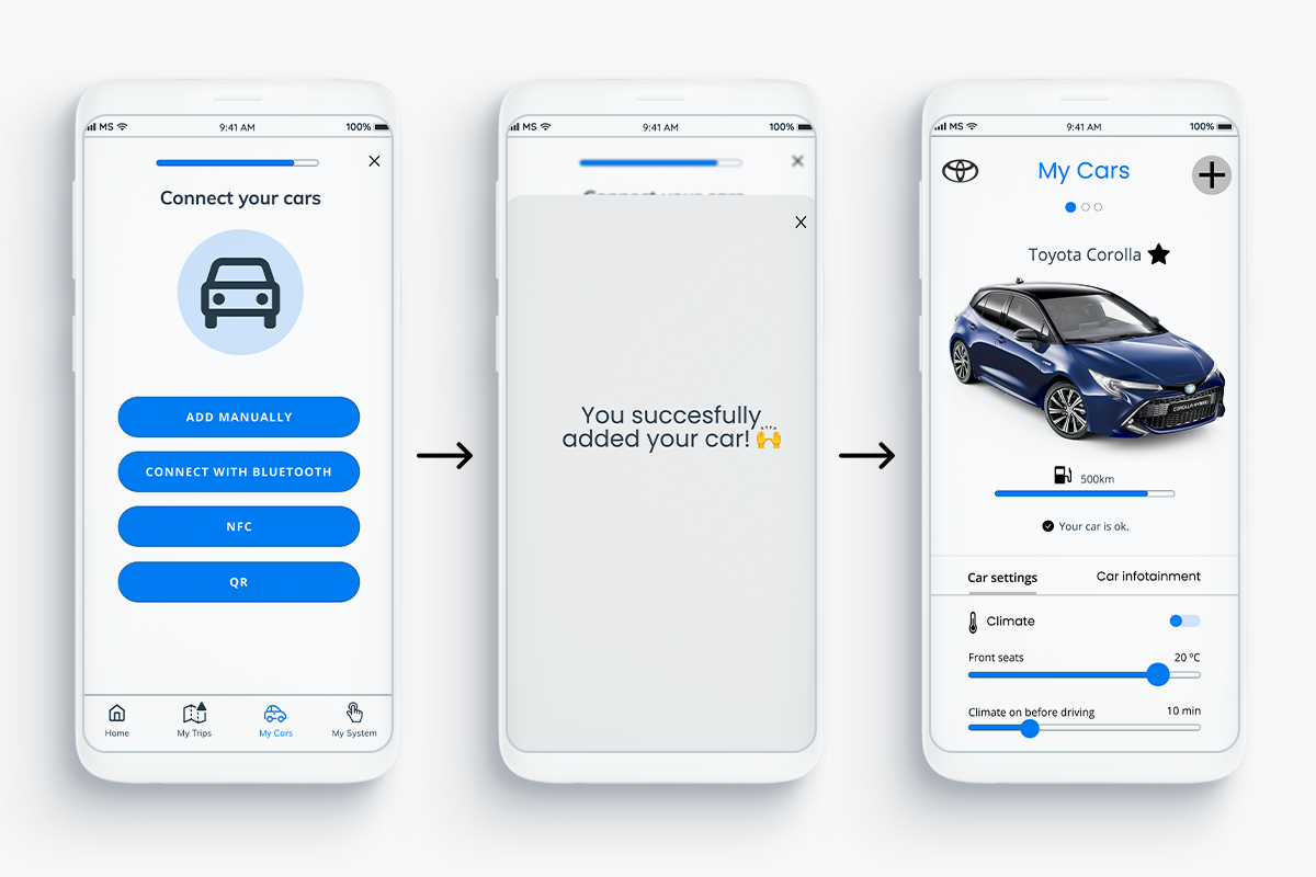
Creating UX flow helps us to understand the whole user journey and covering all the screens necessary for our app. We decided to do two flows, one for the “connecting your apps” functionality, and another one for the “create your trip” one.
4. Prototype
Wireframes & Testing
We had a list of screens to cover all scenarios so we started to do low-mid fidelity wireframes to detail out the flows. In this step, we also started to do some collaboration sessions (5 users) and usability testings (9 users) so we could test our ideas and screen and make any change in an early stage.
A/B Testing
As we were testing our low-mid fidelity prototype, we decided to run an A/B test for the trip route creation. Results show that users preferred a screen-to-screen process, aka conversational screens, rather than doing the whole process on just one long screen.
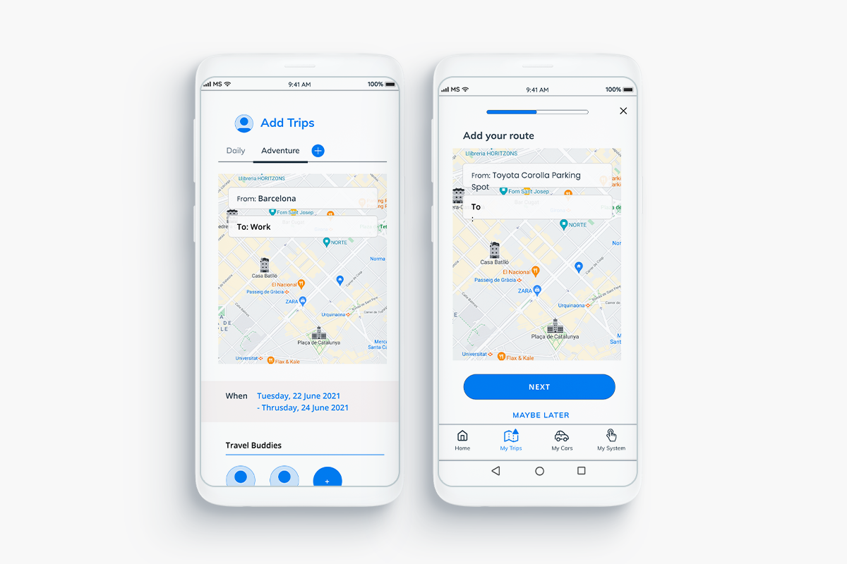
Testing results
We were really impressed and satisfied with our testing. Users gave us some great opinions and new opportunities to design a better product.
They were also really exicted about a few features we added:
- Being able to set everything outside the car.
- How easy and simple will be to bring your own set up to different cars.
- Being able to share routes and their creation with people (Travel buddies).
- How easy it is to erase data and detach your information from a car, but keeping all your settings with you.
5. High fidelity prototype
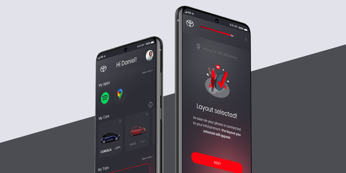
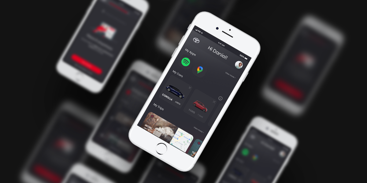
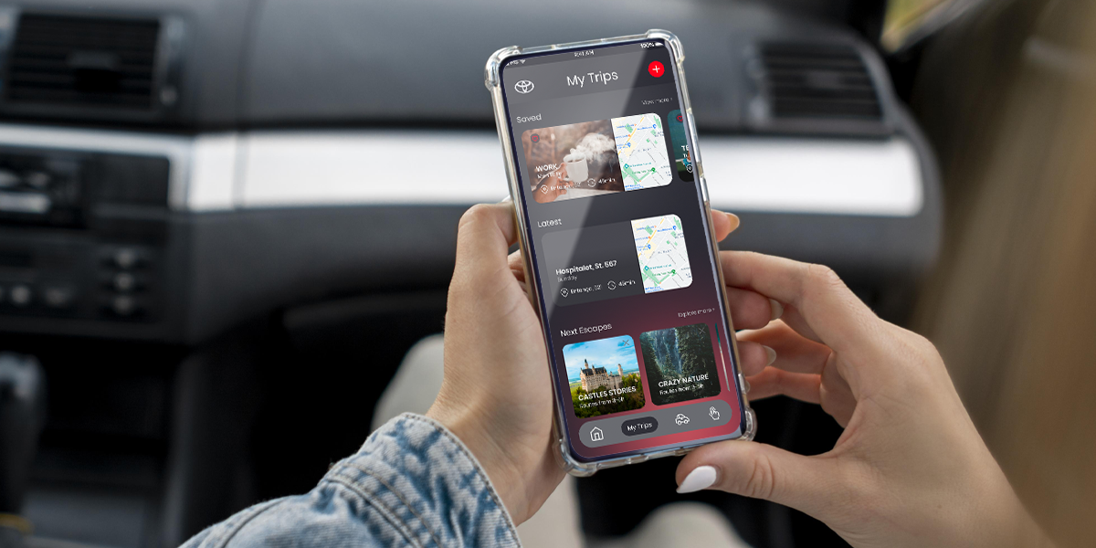
After our testing results were in, we were ahead and started designing the UI for our app.
We decided to go for a little of a futuristic look at the app because our product was thought for a recent future since is an automotive product. We kept the brand’s main colors: black, grey, and red.
6. Next Steps
The future of this project is open. We have a lot of ideas, testing, and prototypes to make regarding this project. We will keep working on it. Who knows what the future holds.
And if you read the hold project, thank you! ❤️
You can contact me here.
